New Corporate Identity
Reliability is key when processing agri, wood or recycling. Modesta’s smart air filters keep factories clean, safe and healthy to ensure non-stop performance. With 75 years of experience in modular air filtering, Modesta gladly helps maximise productivity.
Modesta started operations in 1949, in a small town in the eastern part of the Netherlands. The company initially specialized in the drying and conditioning of grains and grasses, but due to changing market demands, it shifted towards ventilation technology for the wood industry. Diederick Kloppenburg, owner of Modesta and son of the founder, joined the company at age 22. His son Wyboud followed in 2012. Wyboud is the third Modesta generation. After a large renovation in 2007, the company now has an office and production plant in Putten, where all the machines are produced and assembled.
After about seventy years of operation, it is time for rebranding. Modesta decided to work with ZICHZACH after seeing the work done at Qreenno, ERC Machinery and later when they fused with Propak to become Eqraft.
The logo and complete visual identity after the rebranding had to stay close to the Modesta logo designed initially by the founder of the company. They however had to be modern, universally applicable and able to be used for the foreseeable future. A true challenge that is hard to accomplish without taking compromises.
After long talks about the history, identity of the company and the core Modesta values, the rebranding could begin. First, a font had to be found that is modern, universally available and timeless. Then the colour palette had to be thought through: what is fresh, empowering and instantly reveals what Modesta does? Then the slogan had to be revisited: does it still represent the heart of the company?
Once all these questions were answered, the complete visual identity could be presented. The choice was a logo in a style similar to the old logo but also completely different. The logo is made in a modern font that could be duplicated: TheSans, a fresh look of the original logo.
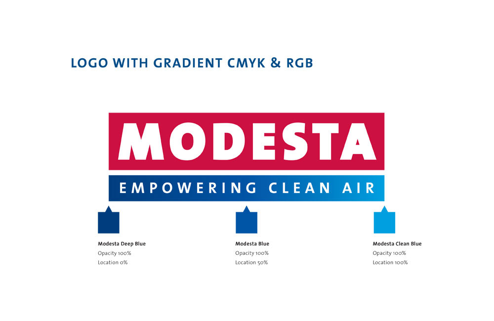
The choice of colours used were altered but remained the same at the core: red and blue. A fresh red that reveals the Modesta energy and the power they want to give to each of their companies, a blue gradient that transforms from deep blue to clean blue portraying the air cleaning effect of the company.
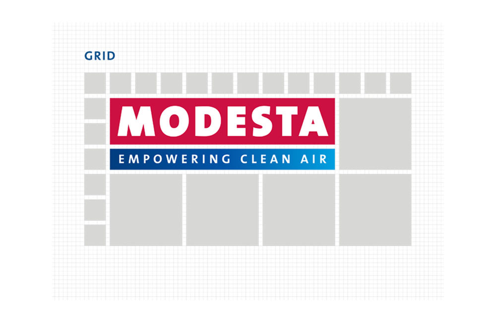
The logo format is comprised of blocks that fit in a modular grid. Which can be scaled and rearranged and still fit! Just as Modesta machines, which are made to be modular.
Finally, the slogan was revealed to be: empowering clean air. The heart of what the company does: it empowers the customers to be reliable partners in business ensuring non-stop performance and thus maximising the productivity.
Together with the new visual identity the following products were (re)developed for Modesta: the logo, company font and colours, advertisements, business cards, Microsoft Office templates, e-mail signatures, badges for the sales team etc.